Overall, my project I feel was successful in researching the effects of urbanisation on both lifestyle and architecture. I managed to focus on my themes, while at the same time, experimenting with different styles an developing photographic styles such as documentary photography and tilt shift. When I began my project, I wanted to portray the contrasts between urban and rural areas, making use of stop motion animation, with hopes to create a final result of a short stop motion film involving both pieces taken in rural areas and in urban areas to show contrast. However, I realised that accessing rural areas would not be practical due to living in an urban area, therefore I shifted the focus to just urban areas. For my first urban based shoot, I tried to capture urban architecture, using black and white to create a sense of urban architecture being prison like, which I feel was effective in creating a bleak atmosphere. I expanded on my look at architecture through my fifth shoot, in which I expanded on my approach of the topic by incorporating HDR processing, which gave my images a wide tonal range. While I had these two shoots, I felt that I wanted to revisit the first architecture shoot I completed, changing something about the shoot; I decided I wanted to shoot in many of the same locations I had used, but shoot them at night. I felt that this shoot expanded on my project overall, as it portrays the same location in a different mood; I decided to not make use of noise in my images this time around, creating a much less sinister mood. In addition to capturing urban architecture, I also completed several people-based documentary shoots. In my fourth shoot, I brought a tripod out to the town with a theme of the fast pace of urban life, and I captured some motion blur images of people walking quickly through town to reflect this. I shot these images in a wide angle format, which is something I carried on into my sixth shoot, in which I incorporated urban landscapes and documentary photography together, linking my architecture and people themes. I further expanded my documentary approach in my ninth shoot, removing the motion blur element and shooting without the aid of a tripod; I feel that this was my most successful shoot as the images created strong narratives about the people in the images.
To create my final portfolio, I mainly drew from the straight image that I had created throughout my shoots. First of all, I went through each straight images post and took three images which I thought were the strongest in the post. This left me short by around ten images, therefore I made another sweep through my straight images, picking some that fit strongest into either representation of people in an urban environment or representation of architecture in an urban environment. I tried to pick images in a way that my portfolio has section of photos that looked as if they worked as a series, therefore some of the straight images I re-edited to link to others, removing some black and white elements of my eighth shoot and creating a series of desaturated urban decay themed images.
I would say that I have definitely created a cohesive body of work from my project. While I did change my project focus, originally intending to focus on both urban and rural locations and the contrasts between them, I feel that once I decided to keep to urban areas, I managed to decide what my main themes were quickly;urban architecture and urban people. I explored various types of urban architecture, capturing both modern, sleek urban buildings and brutalist inspired older urban buildings. I also used this theme to look an urban decay, taking pictures at an abandoned school which had a very square and repetitive architectural design. Within the theme of people, I experimented with different approaches to portraying this. For example, I did shoots that were very impersonal to the subjects, with one of them using motion blur to portray the fast pace of life in urban environments and also taking photos from high up on top of a car park to portrays those who live in urban environments being overshadowed by the large architecture. I also did some shoots that were far more personal to the subjects, getting closeup and showing interactions between people and their facial expressions. Overall, I would say that I have produced a cohesive body of work as all of my shoots fall under the themes of either urban people or urban architecture, and I have used a variety of photographic methods to portray these themes.
My research has heavily influenced my shooting methods and the type of photography I have incorporated. With my two early animation shoots, I drew influence from Eadweard Muybridge, who I researched for my essay. Although he didn't create animations, his method of setting up several cameras to trigger as a horse runs past was a large inspiration on my use of multiple shoot mode to capture motion while I myself was moving. There are also several photographers from my research logs that inspired the way I conducted shoots throughout this project. One example would be the Dutch documentary Photographer Bas Losekoot, who shot a series called the urban millennium, which focused on the interaction of people in urban areas, particularly of multiple cultures. The series' photographic style is usually high contrast, high saturation images which focus closely on a single subject, from which the viewer can create connotations. I tried to replicate this in my images, making use of narrow depth of field to draw attention to the main subject of the image, as well as editing them to increase the contrast and saturation, which I felt made my image create a more positive atmosphere. Another Photographer that inspired my shoots was German architectural Karl Hugo Schmolz, who was active in post war Germany and captured Bauhaus architecture, which was the popular style around the time. He put careful thought into composition, making use of golden triangle and rule of thirds composition rules to frame his image in a way that the buildings had a strong sense of depth and often incorporated leading lines. This pre-visualised composition style was something I took into consideration when shooting my architectural photography; I selected areas in which I could create a sense of depth by using the golden triangle rule to create layers in my image, as well as incorporating leading lines that lead you to the focal point of the image.
Overall, I would say that I've learned a great deal from this personal investigation. I originally set out to portray the contrasts in lifestyle and architecture between rural and urban locations, but quickly decided that I wanted to narrow my focus to exploring the lifestyles and architecture in urban environment. Through my research, I discovered different urban architectural movements and how they influence the architecture around my town. I learnt that as my town was built in the 1960s and developed a lot in the 1980s, the Brutalist movement has heavily influenced the appearance of a lot of my town. I decided that this would be an opportunity to portray urbanisation as something that is vulgar yet powerful and unstoppable; reflected in the very square, bulky and repetitive architecture. The other part of my proposal was to investigate the effects of urbanisation, both on people and on the land. From my research, I noticed that many urban photographers link fast and busy lifestyles to city life, which is something that I tried to make heavily present in my project. From my shoots, I use such techniques as motion blur to create a sense of crowd anonymity and portray this fast pace of urban life, as well as tilt shift to make people appear as if they are miniatures, creating a sense of people being overshadowed by urban architecture. Additionally, I learned of the negative impact that urbanisation has on nature, and how urban structures can be quickly built then abonded and left for nature to retake the land. This is something I incorporated into an urban decay themed shoot, in which I shot at an abandoned secondary school where plants had covered a large amount of the structures. If I had more time, I would have liked to further look into the themes of urban decay, as it was difficult to find many abandoned locations that were in walking distance of me, and I felt this was one of the key effects of rapid urbanisation.
Tuesday, 25 April 2017
Monday, 24 April 2017
Computer Experiments

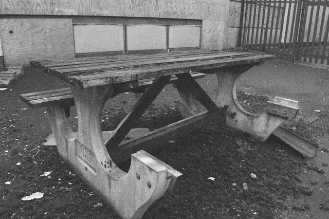

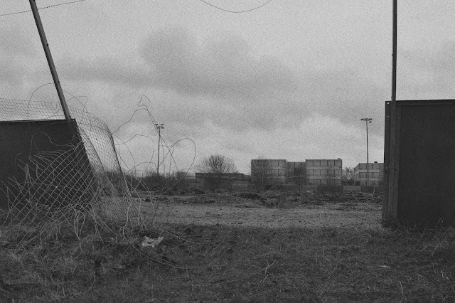
I have made use of converting my images to black and white in Photoshop, as well as adding noise to give the images a gritty atmosphere. I converted to black and white by selecting the black and white adjustment in the adjustments panel above the layers box, then added noise by going to filter>noise> add noise, then dragging the percentage slider to my desired amount.
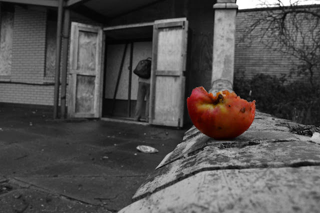
I also made use of selective colourisation. I created this image by using the quick select tool, then selecting the part I wanted to remain in colour. I did selected layer>invert, which inverted the selection so that when I converted to black and white, my desired area would remain in colour.
Another Photoshop technique I used is HDR. To create my HDR images, I shot in Camera RAW format and used auto bracketing on my camera, setting it to two steps. To merge each set of three images together to create one, I opened them in photoshop and selected file>automate>merge to HDR pro, making adjustments to brightness and contrast in HDR menu.
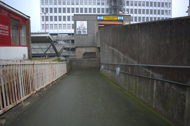
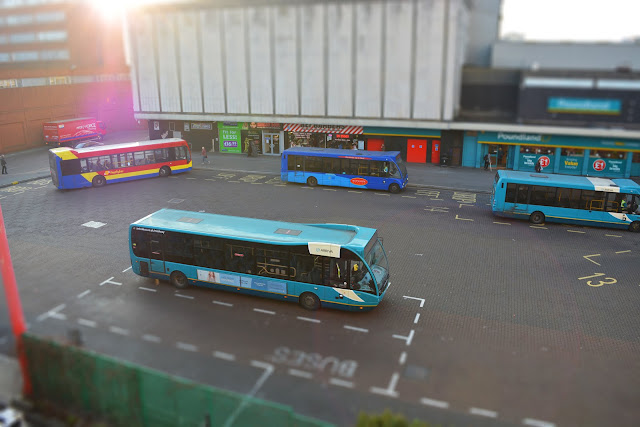
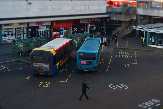
 I have also experimented with the use of tilt shift filters to create miniature style effects from my low angle landscape shots. I shot images of a busy bus terminal from the top of a car park. Once I opened them in Photoshop, I went into filter>blur gallery>tilt shift, then set the blur threshold so that the people and buses in the images in focus and the area around them is blurred, making them appear as if they are miniatures. Tutorial here.
From my first two shoots, I created some stop motion animations, one of which can be seen below. I captured the pictures while shooting on continual shoot mode on a moving boat and created the video file in Adobe Premier Pro. I dragged all of the images onto a video timeline in the program, the right clicked the timeline and selected speed/duration and dragged the duration of each picture to be one frame per image. I then rendered and exported the project as a .MOV file. Video tutorial of this method can be seen here.
Shoot Ten - Work Diary
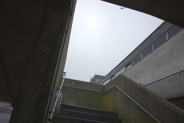
For my final shoot, I decided to make a final extension to my exploration of the topic of urban architecture, opting to shoot something which creates some contrast to my previous architecture shoots. I decided to shoot in similar locations to those used in my third shoot, with the variable being it would be dark when shooting this time around. I hoped to create a contrast between urban activity in the day and urban activity at night.

This was taken using a shutter speed of 1/5 of a second, with an aperture of f5.6 and the ISO set to 320. I shot this with the camera mounted on the tripod, therefore I was able to increase the shutter speed in order to expose my image enough, rather than turning the ISO to a high number, and as a result the image is low in noise, creating a very smooth lighting effect throughout. The street lamps in the image give off light in a very muted shade of yellow, which creates a sense of unhappiness throughout the image, as yellow usually represents happiness therefore the fading of yellow could represent a fading of happiness. This sense of unhappiness carries in the architecture that can be seen throughout the majority of the image , which has clear Brutalist influences and creates a very cold and cynical atmosphere, suggesting that urban life itself if cynical in nature.
This was taken with a shutter speed of 1/3 of a second, with an aperture of f5.6 and an ISO of 320. Like the previous image, this also makes heavy use of street lights for lighting, creating another muted yellow tone that suggests that urban life can make you unhappy. This also has some presence of nature in the composition, with a tree being present underneath the lamp post. The tree is being cast underneath the lamp's yellow light, which creates a commentary on nature, despite having been in existence forever, now lives in the shadow of urban structures. This is further shown through framing; the image was taken from a high angle, meaning the building above is shown to appear as if it towers over both the viewer of the image and the tree, suggesting that people may feel as if large, dull urban structures are shadowing over human life as well as plant life.

This was taken using a shutter speed of 1/5 of a second, with an aperture of f5.6 and the ISO set to 320. I shot this with the camera mounted on the tripod, therefore I was able to increase the shutter speed in order to expose my image enough, rather than turning the ISO to a high number, and as a result the image is low in noise, creating a very smooth lighting effect throughout. The street lamps in the image give off light in a very muted shade of yellow, which creates a sense of unhappiness throughout the image, as yellow usually represents happiness therefore the fading of yellow could represent a fading of happiness. This sense of unhappiness carries in the architecture that can be seen throughout the majority of the image , which has clear Brutalist influences and creates a very cold and cynical atmosphere, suggesting that urban life itself if cynical in nature.

This was taken with a shutter speed of 1/3 of a second, with an aperture of f5.6 and an ISO of 320. Like the previous image, this also makes heavy use of street lights for lighting, creating another muted yellow tone that suggests that urban life can make you unhappy. This also has some presence of nature in the composition, with a tree being present underneath the lamp post. The tree is being cast underneath the lamp's yellow light, which creates a commentary on nature, despite having been in existence forever, now lives in the shadow of urban structures. This is further shown through framing; the image was taken from a high angle, meaning the building above is shown to appear as if it towers over both the viewer of the image and the tree, suggesting that people may feel as if large, dull urban structures are shadowing over human life as well as plant life.
Shoot Nine - Work Diary
For my ninth shoot, after capturing urban architecture, I wanted to
expand on my previous work that involves people and how they interact in
an urban environment, moving closer to my subjects and cutting out a
lot of the wide angle landscapes I featured in my previous people based
shoots. I went out into town without a tripod so that I could move more
freely and tired to capture scenes that I thought would let the viewer
of the image create their own narrative from; I shot from a documentary
perspective.

I shot this using a shutterspeed of 1/250, with an aperture of f5.6 and an ISO of 200. I kept the shutterspeed relatively high as I was shooting freehand and as the subjects in this shoot are unknowing that they are being photographed, the lens was fully zoomed in so that I could remain unknown from a distance. I originally shot this in colour, but decided I wanted to make a large amount of the image black and white in editing after the shoot. I selected the image of the London Eye in the background using the quick selection tool, then inverted the selection and converted the image to black and white, with the selection meaning that area was excluded from the conversion. The use of the selective colourisation points out comparisons between poor and working class urban areas and affluent urban areas. The image of London being colourise creates the connotation that London is exciting and upbeat, and the sky blue colour that is featured heavily in the image creates the contrast between London and Harlow, which is represented as being dull through the use of the black and white.

This image was taken with a shutter speed of 1/100, an aperture f7.1 and ISO 200. I set my shutter speed significantly slower than in the previously shown image, as the position I was in had the opportuntiy to capture people in motion, therefore I wanted a slower shutter speed to create some motion blur with the people in the foreground to link to the theme of the fast pace of urban life. I had my camera fully zoomed in so that I could capture my subjects closer. I focussed on the two women sitting down outside a coffee shop having a conversation, meaning the foreground is the part of the image that was out of focus. The presence of both people who are quickly walking through town and the two women sitting creates connotations of different paces of life that are present within urban environment, with some having no choice but to be constantly be busy to get by in life, while others have the freedom to participate in some leisure activities throughout the week.

I shot this using a shutterspeed of 1/250, with an aperture of f5.6 and an ISO of 200. I kept the shutterspeed relatively high as I was shooting freehand and as the subjects in this shoot are unknowing that they are being photographed, the lens was fully zoomed in so that I could remain unknown from a distance. I originally shot this in colour, but decided I wanted to make a large amount of the image black and white in editing after the shoot. I selected the image of the London Eye in the background using the quick selection tool, then inverted the selection and converted the image to black and white, with the selection meaning that area was excluded from the conversion. The use of the selective colourisation points out comparisons between poor and working class urban areas and affluent urban areas. The image of London being colourise creates the connotation that London is exciting and upbeat, and the sky blue colour that is featured heavily in the image creates the contrast between London and Harlow, which is represented as being dull through the use of the black and white.

This image was taken with a shutter speed of 1/100, an aperture f7.1 and ISO 200. I set my shutter speed significantly slower than in the previously shown image, as the position I was in had the opportuntiy to capture people in motion, therefore I wanted a slower shutter speed to create some motion blur with the people in the foreground to link to the theme of the fast pace of urban life. I had my camera fully zoomed in so that I could capture my subjects closer. I focussed on the two women sitting down outside a coffee shop having a conversation, meaning the foreground is the part of the image that was out of focus. The presence of both people who are quickly walking through town and the two women sitting creates connotations of different paces of life that are present within urban environment, with some having no choice but to be constantly be busy to get by in life, while others have the freedom to participate in some leisure activities throughout the week.
Wednesday, 19 April 2017
Shoot Eight - Work Diary
For this shoot, I wanted to try and capture some abandoned areas, keeping to the theme of urban decay. I looked around Harlow for a location that had been left alone for a long while, as this would mean that nature has taken over what was once man made, linking to my theme. I found an abandon school ground that was open to the public, which is where I decided to complete my shoot


This is one of my straight images from my shoot. I shot this image with a shutterspeed of 1/100, with the aperture of f11. I shot on this shutter speed as I was shooting without a tripod and wanted to avoid camerashake; my aperture I set to F11 as I wanted a fairly wide depth of field, as the image is landscape style image. This image links well to my subject of urban decay as the image depicts a field on a schoolground, on which the grass has become unkempt and overgrown and has covered some of the school structures in the background. The image makes heavy use of shades of green throughout the foreground and midground, which I have emphasised by increasing the colour saturation as well as shifting the colour balance to reduce yellows and increase greens. As a result, you get both saturated and muted shades of green throughout the grass, which could be seen as a reflection of the negatives and positives of a place like this being reclaimed by nature. The bright green shades represent the positive in that the structure is unnatural and was put in place where there once was nature, therefore the process is in a way a "return to normality", whereas the muted shades could represent what is lost in the school being abandoned, as it was once a place of learning.
Here is another of my straight images from my shoot. Like the previous image, this was also taken at 1/100 with an aperture of f11 in order to keep the depth of field wide and avoid camerashake from handheld shooting. This photo as been editing far more than the other image, as I wanted to create a gritty and dark mood from the image. To create this mood, I converted the image to black and white, then went into photo filters and added noise to the image, creating an overall rough texture of the image. It depicts and bench that has had once of its seats broken off. The floor below it has gathered large amounts of moss, as the bench has been left untouched and the area has been rained on; this links very strongly to the themes of urban decay and urban structures being retaken by nature. The use of black and white and noise in the image creates a very sinister mood, as it creates a wide tonal range, with tonal contrast between the dark tones of the moss on the floor and the light tones on the wooden boards that cover the buildings. This contrast creates connotations of the strength of nature against urban structures that have been left unattended for a long period of time.
Subscribe to:
Comments (Atom)

