
Here is one of my favourite images from my shoot. This image is one of my final straight images, therefore it has been edited. I decided that my straight images should have the effect of looking like an old film photograph. To create this effect, first of all, I converted them to black and white. Then, I added a brightness/contrast layer, in which I moved the contrast to around -20, giving the image a washed out appearance. The final stage in editing the photo into look like a black and white film photograph was to add noise to the image. I did this by going to the filter drop menu, and selecting "add noise", in which i set the noise percentage to around 30%. This finalised the editing on the photos, which meant I could flatten the image and save it as a JPEG.
This image has a wide tonal range; half of the image displays dark tones, as this was taken in a multi-storey car park, in which there was little lighting. However, the lights on the ceiling and the small opening to the sky to the right create some lighter tones, particularly on the pillars to the right. Since the image is in black and white, the colours in the image are varying muted shades of black or white, giving the photo a very dark mood and creating connotations of evil. The shapes formed in this image are mainly made of sharp corners, with there being very little curves in the architecture, which is very urban and reminiscent to the Brutalist architecture of the 1950s-1970s. Due to the editing I have done to the final version of this photo, the image appears to have a slightly bumpy texture, which was created from the noise I added to the photo. Before the edit, the majority of the image was smooth textures, and I feel that the noise I added means the image contains darker connotations now, with the bumpy textures creating connotations of the busyness of living in an urban environment. This, however, is contrasted by the fact the image portrays an almost empty car park.

Above is another of my favourite edited images. This has been edited in the same way as the previous image, being desaturated, converted to black and white then noise being added. This image is much tonally lighter than the previous image, meaning when the use of undersaturation and black and white makes the image look particularly washed out. The sky in the background looks like it's more cloudy than it is, and in areas it looks like there is a smog in the sky, which creates a sense of urban environments being very pollutive. The use of noise in this image creates a rough texture, particularly on the building in the foreground, which creates connotations of the rough side of urban life, which links well with the architecture in the image; it is that that is typically seen a poorer urban area as opposed to a rich one such as central London. I have composed this image using the rule of thirds composition rule; the point of interest is the building in the foreground, which I have positioned on along the left horizontal line of the rule of thirds grid, which means your eyes are immediately drawn to it. The building in the background has also been positioned on the grid, meaning it is also is positioned in a point where your eyes are drawn to it. However, this photo was taken freehand therefore it's slightly at an angle; I could improve this by either correcting in Photoshop or by re-shooting the image.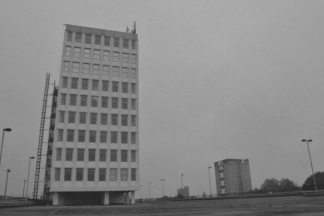

This is the image I have straightened in Photoshop. I did this by using the crop tool and selecting "straighten" on the toolbar along the top. it then prompts you to draw a line at what angle you want it to skew the image. I adjusted mine by about 2° downwards from the left to the right. As you can see, the resultant image is stabilised and appears as if it had been taken with a tripod.
good but take a leaf out of Ansell Adams book and work the tonal range the images are a little flat and therefore harder to read as they lack contrast..
ReplyDeletealso experiment with distortion correction...
ReplyDeletealthough straightened you have not corrected for distortion, you need to talk to your tutor who will show you.. what to do..
ReplyDeleteok good one final request, feature the before and after images for the car park..
ReplyDeletecamera settings used, depth of field, etc....
ReplyDelete